
Ekara
Industry
Conglomerate
Scope
Branding
A Conglomerate of Strength, Vision, and Adaptability
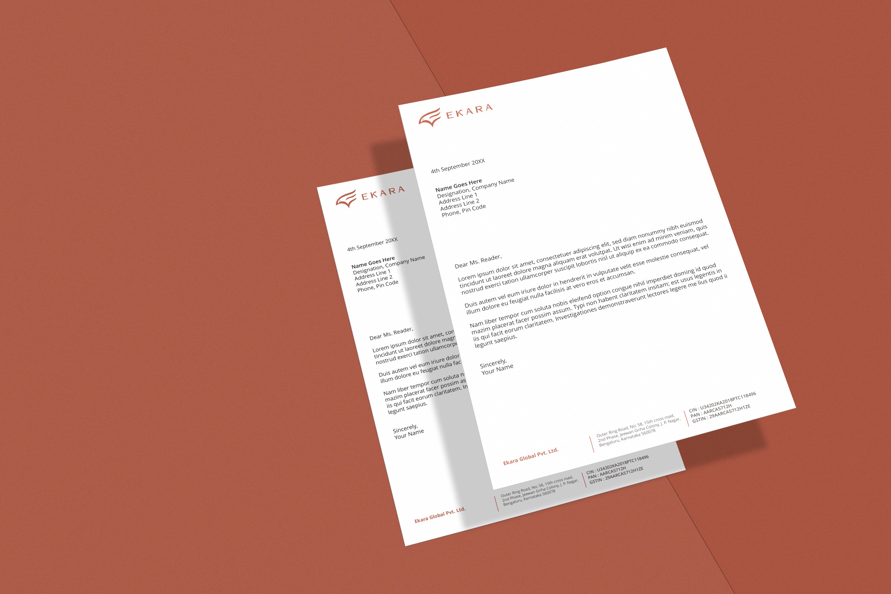
Ekara is a conglomerate that serves as the parent company for multiple brands across diverse industries. The name "Ekara" translates to "Golden Eagle" or "Garuda" in Māori, reflecting strength, vision, and adaptability. To create a unique and elegant identity for Ekara, we focused on developing a logo that embodies these attributes while standing out in a sea of eagle logos.
Brief
t
Ekara needed a logo that would symbolize its core values of adaptability, vision, and control, while also conveying a sense of classic and modern elegance. The challenge was to design a distinctive downward flying eagle logo that would differentiate Ekara from the millions of existing eagle logos and to create a cohesive word mark logo using negative space.
Stratergy
Our strategy involved capturing the essence of a downward flying eagle to symbolize adaptability, vision, and control. The design had to be both classic and modern to reflect Ekara's elegant and sophisticated brand identity. By focusing on the unique attributes of a downward flying eagle, we aimed to create a logo that conveys purpose, power, and balance, aligning with Ekara’s brand values.
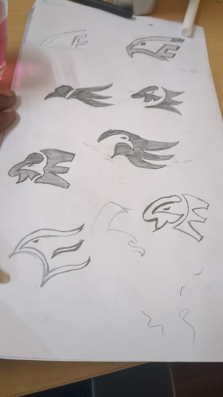
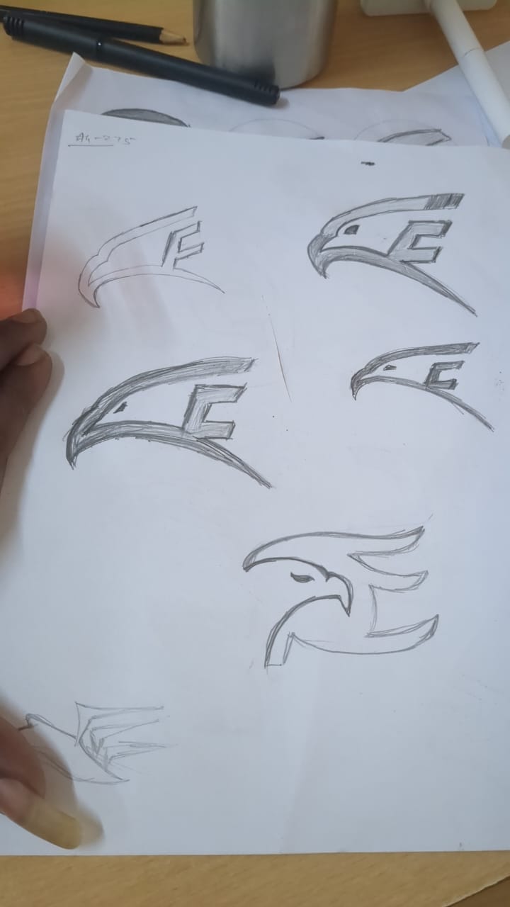
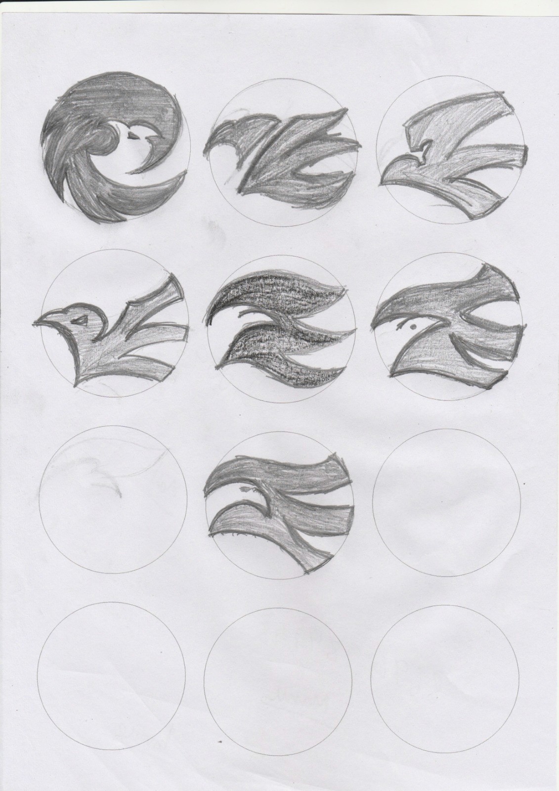
Design Process
We began with extensive sketching sessions to explore various representations of a downward flying eagle. After numerous iterations, we finalized a design that captures the elegance and dynamism of an eagle in descent. The design incorporated elements of adaptability, vision, and control through its poised and focused depiction. Additionally, we developed a word mark logo for "Ekara," utilizing negative space to create a visually engaging and memorable mark.


Outcome
The final logo for Ekara features a sleek and elegant downward flying eagle, symbolizing adaptability, vision, and control. The word mark logo effectively uses negative space, adding a layer of sophistication and modernity to the brand's identity. This cohesive design strategy ensures that Ekara stands out in the conglomerate industry, with a logo that resonates with its core values and sets a benchmark for elegance and uniqueness.


Team
Studio : Headless Hippies Graphic design And Films Pvt. Ltd.
Project Manager: Vibin Venugopal
Print & Packaging : Naresh
Brand Identity : Akhil & Naresh