
Ideal
Industry
Architectural & Building Products
Scope
Brand Identity, Product Brochures, Brand Video
When legacy meets
Innovation
IDEAL Group of Companies is a leading manufacturer and supplier with unparalleled expertise in the design, engineering, and manufacturing of fire and acoustic-rated timber door sets. It is legacy brand that combines the best of old and new. With years of experience and a commitment to
Brief
t
IDEAL, a company with a rich history of over two decades in manufacturing fireproof doors, needed to update its brand identity. The challenge was to modernise the brand while respecting and retaining its legacy and adapting to its diversification into new verticals such as Firestop, Fitous, and Dry mixes.
The goal was to create a fresh, cohesive brand identity that resonated with new and existing markets.

Old Logo
Stratergy
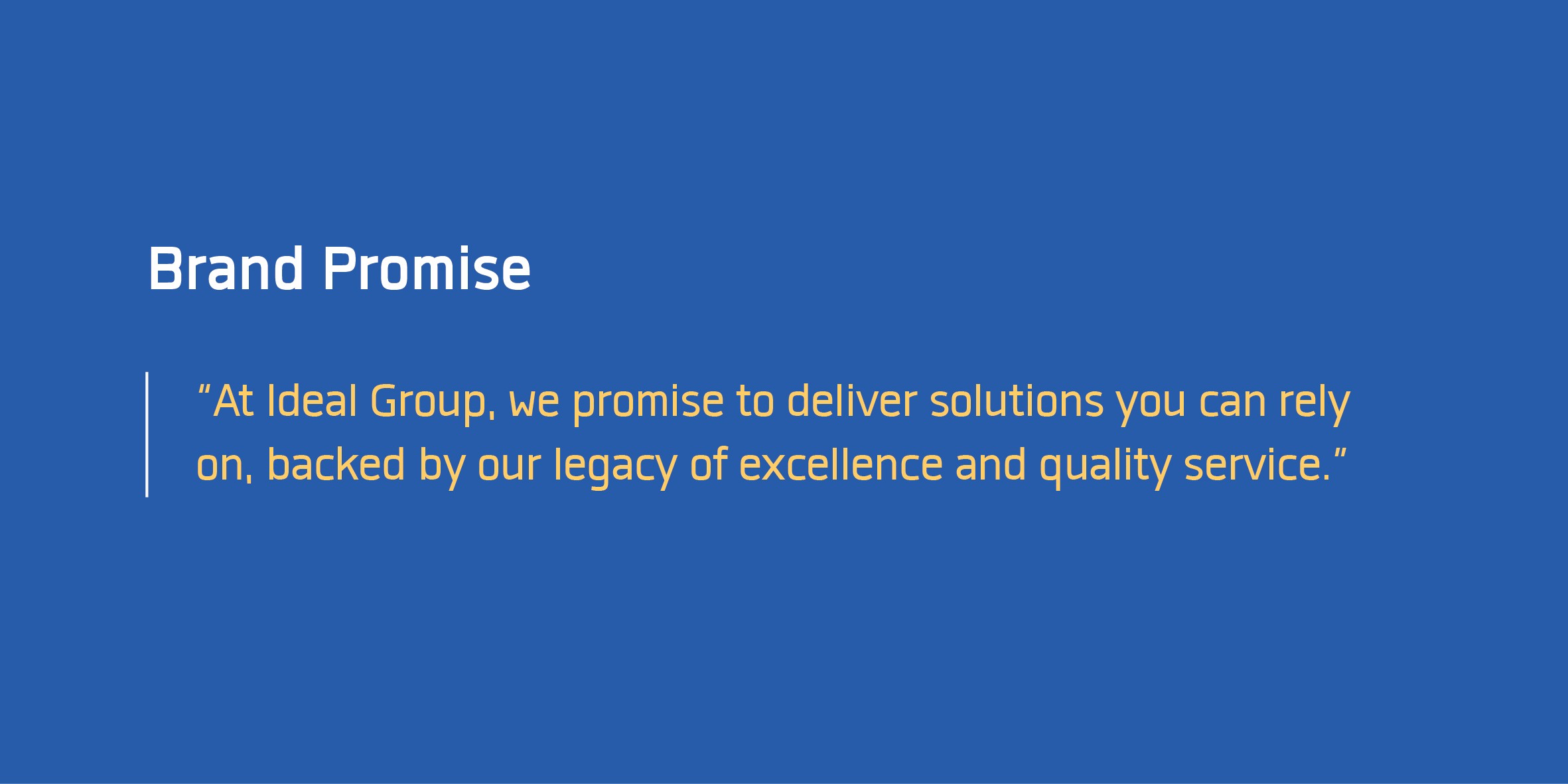
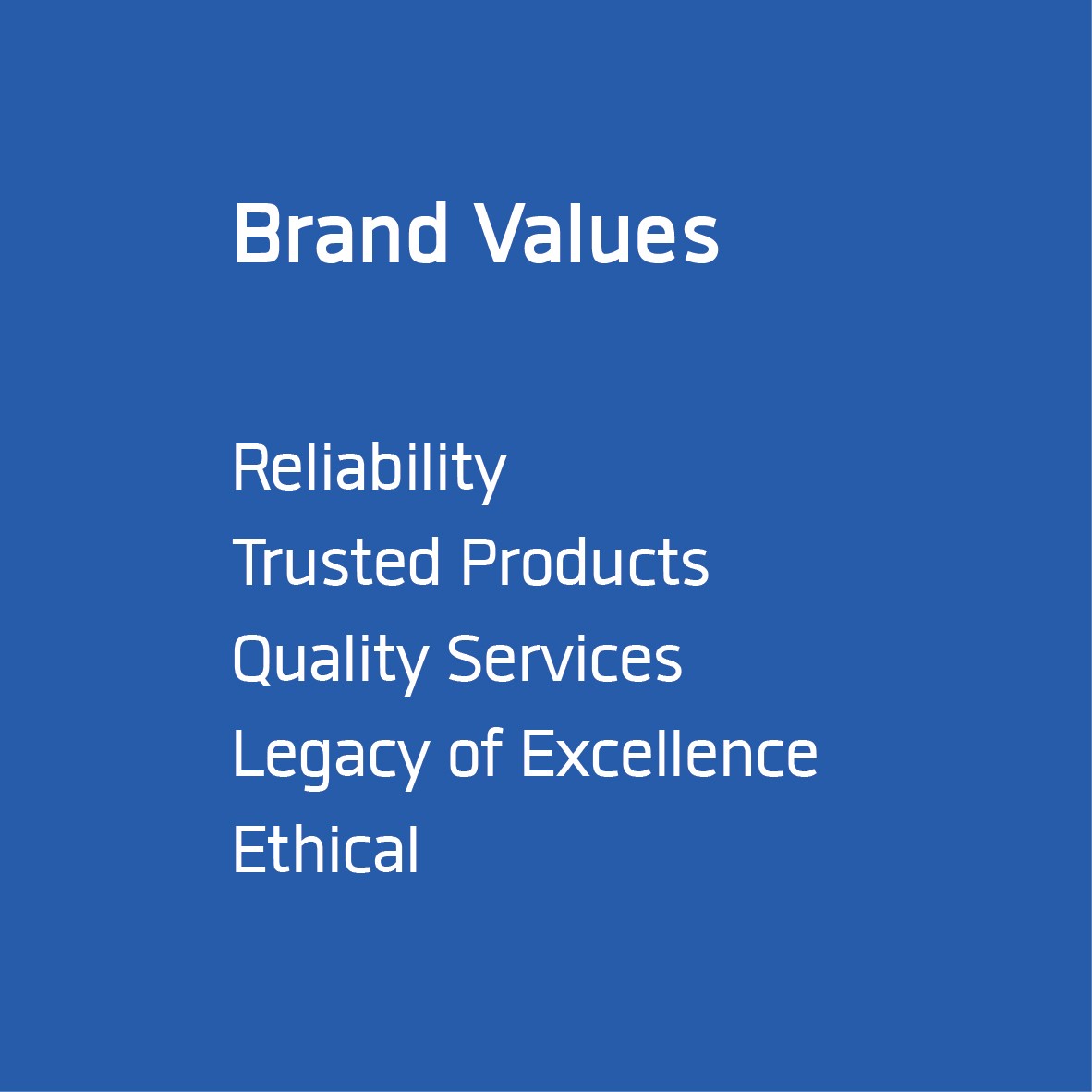
Our strategy centered on blending IDEAL's storied heritage with forward-thinking innovation. We conducted a thorough brand audit to understand the strengths and weaknesses of the existing brand. This audit informed the development of a new brand promise and an updated mission that reflected IDEAL's evolution. We aimed to create a brand identity that communicated IDEAL’s core values of reliability, quality, and sustainability, while also highlighting its commitment to innovation.


Shared Values & Purpose
What did we avoid
The bounding box
Using an existing font
Complexity that exists now
Non Era specific
No explicit monogram

Design Process
Logo Analysis: We started by analyzing the existing logo, identifying its modern and innovative aspects as well as its limitations in flexibility and integration.
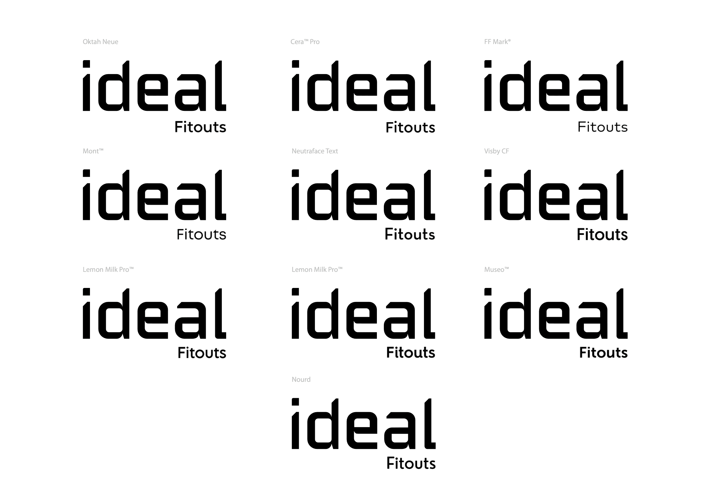
Sketching & Feedback: Using the same grid as the old logo, we sketched over 400 typefaces and refined the top picks based on team and stakeholder feedback.
Custom Typography: We developed a unique type-based logo for IDEAL and its sub-brands. The design incorporated calligraphic elements to honor the past and modern typography to signify innovation.
Consistency: We ensured a cohesive look across all sub-brands by making subtle changes to the "I" dot in the logo, maintaining a unified brand architecture.
Design Sketches

Grid - Working on same foundation
Typeface Exploration for Sub-brands

Master Logo - Blue Background

Master Logo - White Background
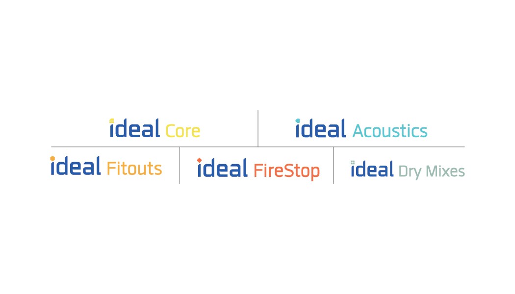
Sub Brands - Branded House Architecture

Color Propostion


Typeface
Outcome
The rebranding resulted in a refreshed visual identity that genuinely reflects IDEAL's mission and values. The new logo and brand design are more flexible, dynamic, and aligned with IDEAL's diverse services. This updated identity not only honors IDEAL’s legacy but also strengthens its position in the market. The new branding appeals to both existing and new customers, solidifying IDEAL's role as a leader in the industry and positioning it for future growth.
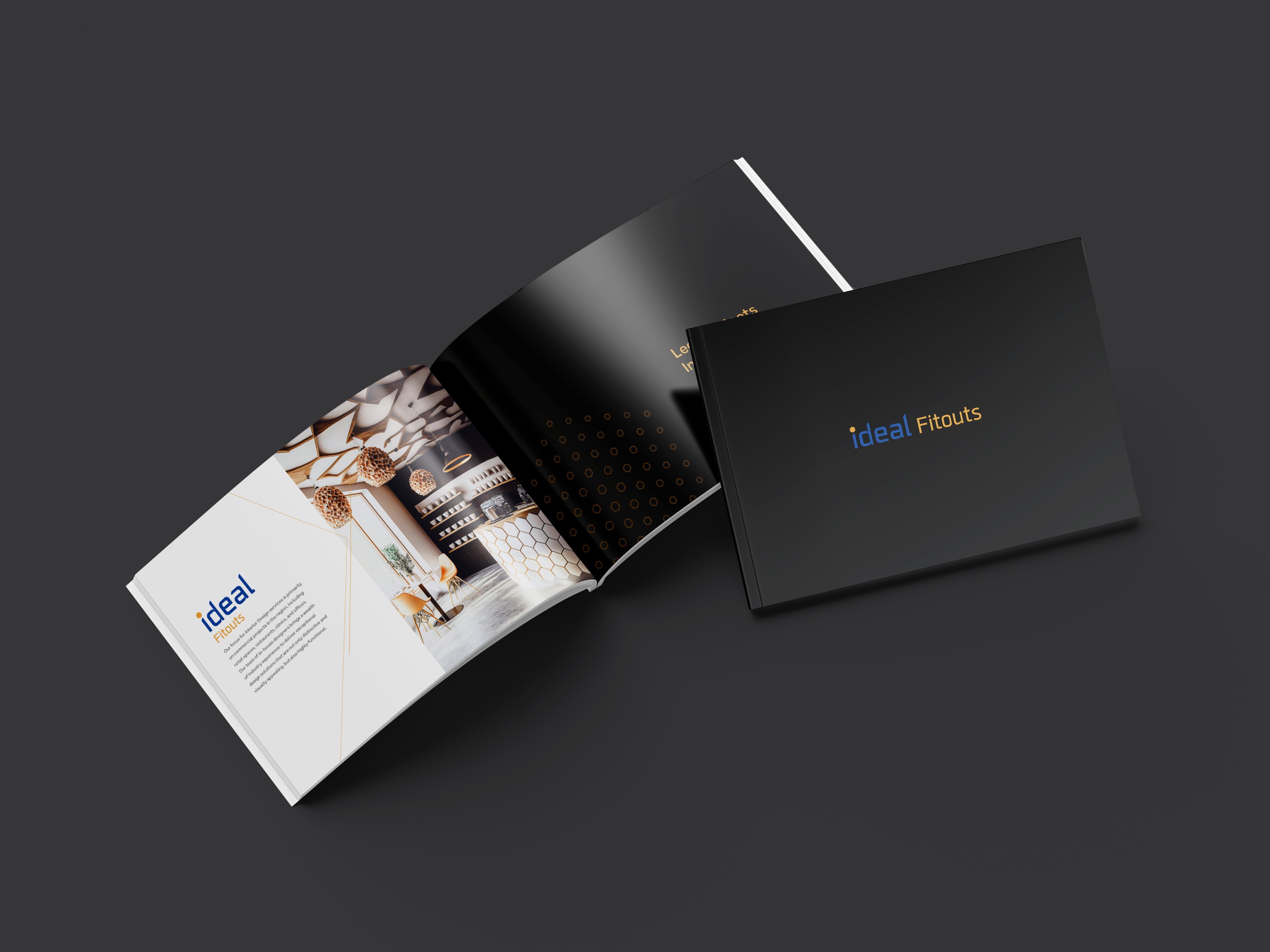
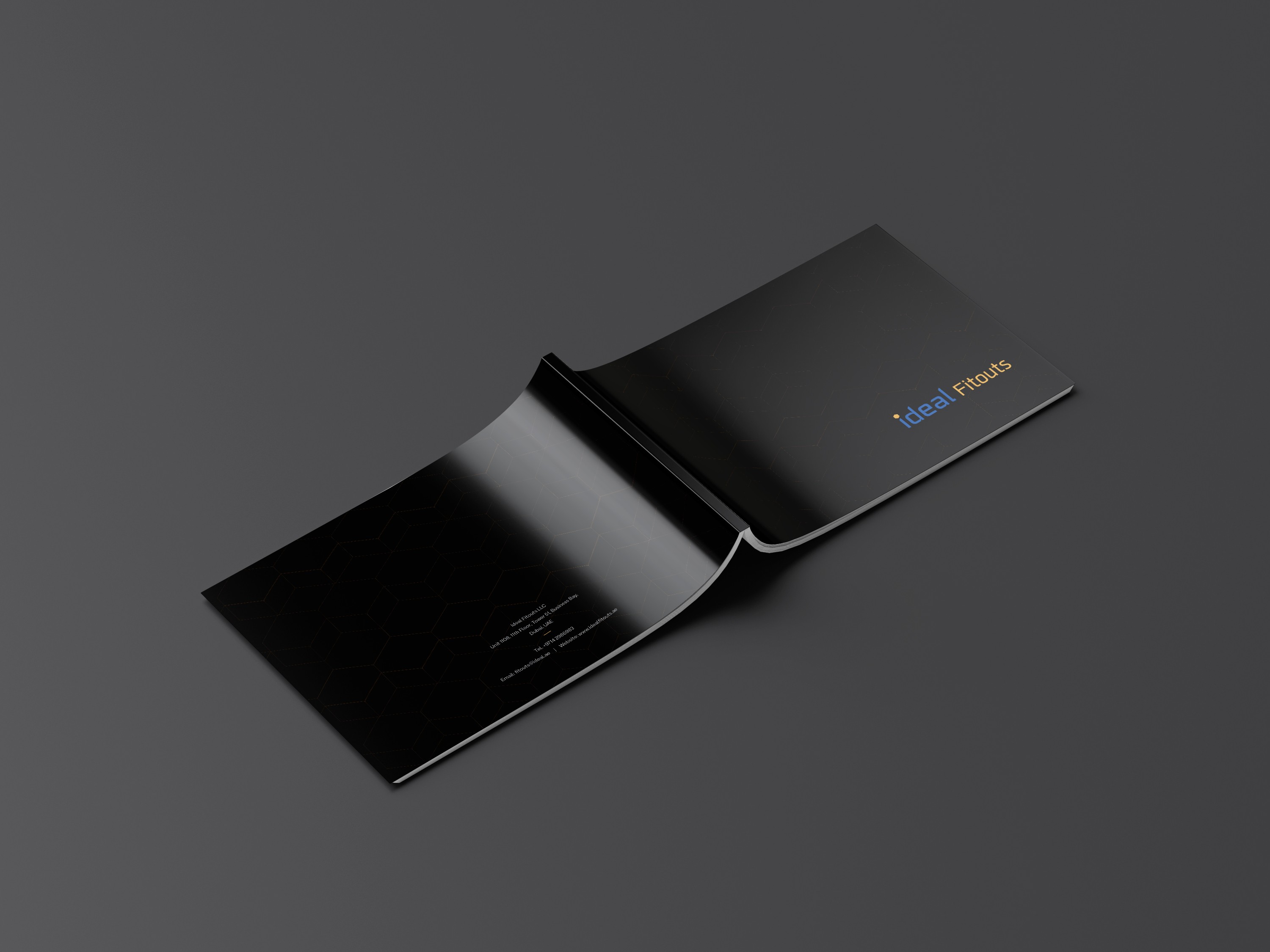

Brochure for Ideal Fitouts

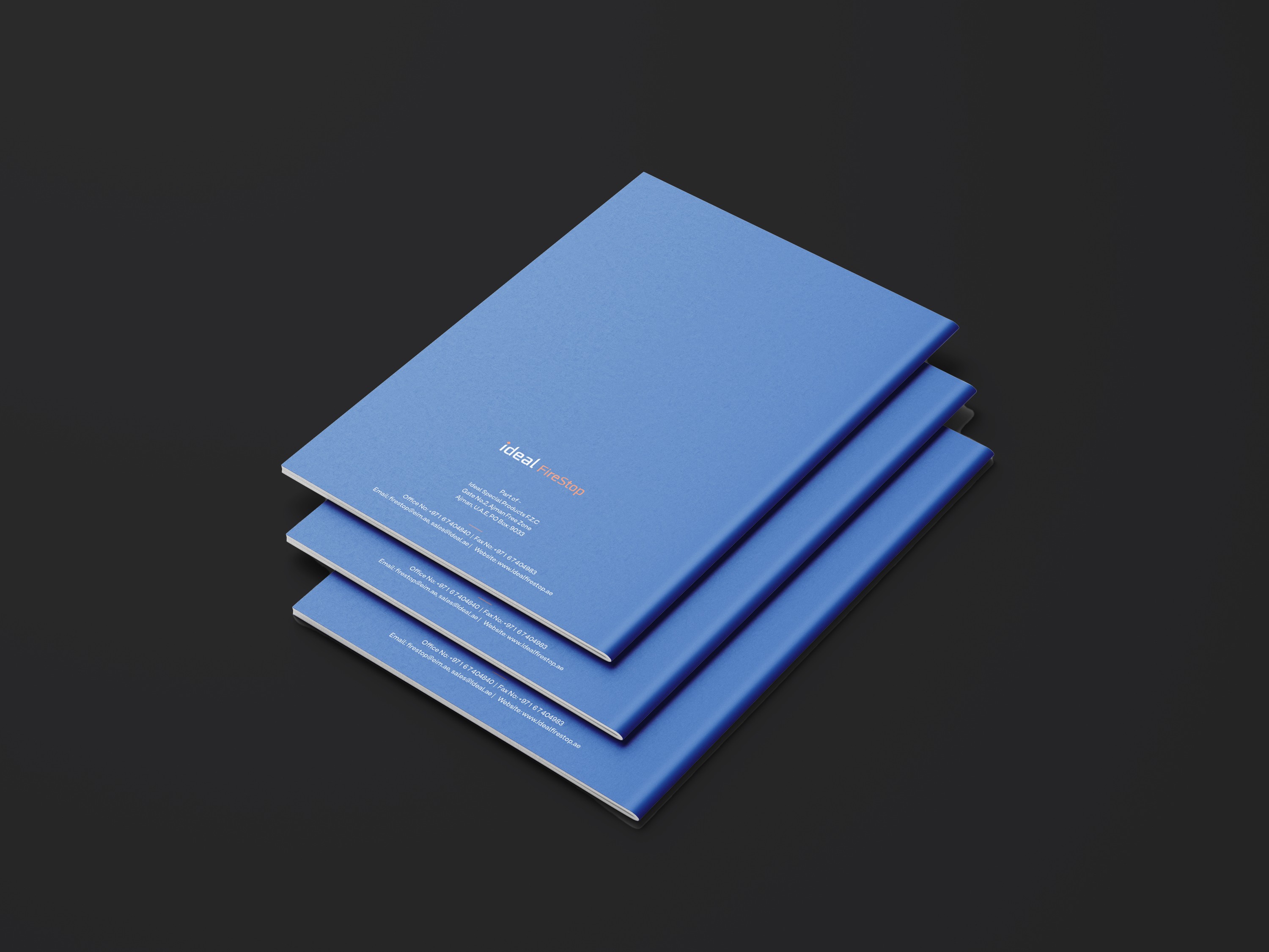

Brochure for Ideal Firestop
Team
Studio : Headless Hippies Graphic design and Films Pvt. Ltd
Project Manager: Vibin Venugopal
Branding & Editorial : Naresh
Motion : Sanjeev, Naresh